woman-hand-hold-supermarket-shopping-cart-with-abstract-blur-organic-fresh-fruits-and-vegetable-on-shelves-in-grocery-store-defocused-bokeh-light-background-stockpack-adobe-stock
woman hand hold supermarket shopping cart with abstract blur organic fresh fruits and vegetable on shelves in grocery store defocused bokeh light background
Share
Facebook
Twitter
LinkedIn
Flipboard
Print
Email

Wealth & Poverty Review Time Pricing Mark Perry’s Chart of the Century

Since 2000 hospital services became 37.7 percent less abundant while TVs became 10,090 percent more abundant.

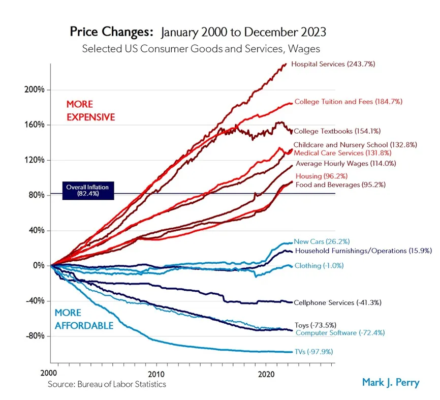
Professor Mark Perry publishes a chart illustrating the percentage change in the nominal prices of a variety of U.S. Consumer goods and services on a regular basis. He also notes the change in average hourly wages. His data comes from the Bureau of Labor Statistics (BLS). This is a great chart but note that prices can increase to infinity but can only decrease by 100 percent (then they become free). 

We have compared each product to the change in average hourly wages to get the change in the time prices. The times prices are then compared over time to measure changes in abundance. This bar chart illustrates these changes.

Continue reading at Gale Pooley’s Substack.

Gale Pooley

Senior Fellow, Center on Wealth & Poverty
Gale L. Pooley teaches U.S. economic history at Utah Tech University. He has taught economics and statistics at Brigham Young University-Hawaii, Alfaisal University in Riyadh, Saudi Arabia, Brigham Young University-Idaho, Boise State University, and the College of Idaho. Dr. Pooley serves on the board of HumanProgress.org.